
A responsively-designed, gamified e-learning tool
for reading and understanding the Bible

My Role
As the sole initial product designer on this project, I worked directly with the CTO of Basil Technologies to brainstorm, strategize, and design a responsive, mobile-first, gamified e-learning platform for reading and understanding the Bible.
The UX Challenge
Learning about the various repeating patterns and themes throughout the Bible can help people better read the Bible. While many commentary resources about the historical, cultural and linguistic contexts exist, the average reader might not find these resources accessible.
Our design challenge was to design an integrated, mobile-first application that would incorporate these in-depth teachings into digestible, engaging lessons that would make this process of learning more fun and individualized.
The UX Design Process
Our team conducted various user surveys to pinpoint the most common pain points when reading and understanding the Bible. We also conducted “How Might We” brainstorming sessions and defined our target user as a mid-level experienced Bible reader.


Identifying our main user demographic was a critical, but a difficult part of the process. At first, we factored in the needs of both new and more experienced readers, because of the differing goals of client investors. Some wanted to use the app as an evangelism tool to help new believers’ accessibility to understanding the Bible, but others wanted to implement it as a tool for existing believers to dive deeper into biblical studies. This wide spectrum convoluted how we approached the design and user flow of the app, so we had to take a step back to narrow down who our target user would be and hone the main goal of our product.
We conducted early-stage user research through anonymous surveys and identified the most common user pain points. I sketched, wireframed, and prototyped some low-fidelity designs. We user-tested our mockups and crowdsourced feedback to iterate further on our designs and streamline our user flow throughout the design process.


Our approach was digital study Bible meets Duolingo — an interactive, gamified Bible reading experience that would provide real-time feedback to our users as they moved through various Bible study lessons. These lesson modules were designed to equip the readers with specific skills and resources, which could be applied to future, independent readings both within and outside of the app and lead to deeper comprehension of the text.


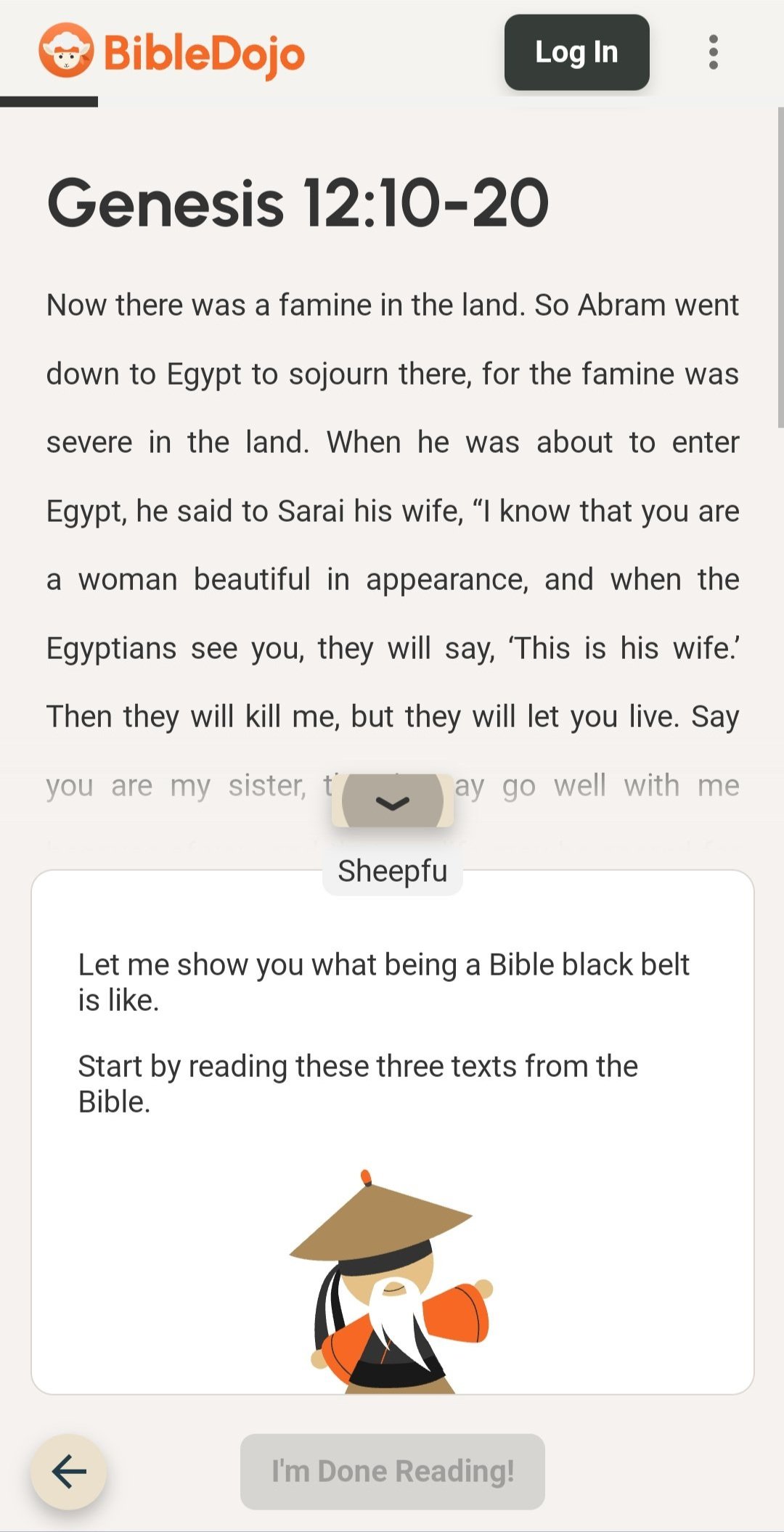
We implemented bottom sheets featuring interactive questions, videos, and responsive feedback to guide the user through each lesson. We conducted user testing to streamline the timing of when the bottom sheet pops up and minimizes to verify seamless, intuitive user interaction.
We wanted to encourage users to slow down and digest the material rather than spam click through lessons to complete them. Thus, we designed separate user journeys for each answer chosen to provide thorough explanations before redirecting users back to select a different answer choice.


We conducted further user research to study user retention and when users decided to leave lessons. We had to effectively minimize user frustration while maximizing learning, which required methods to mark user progress and achievements.
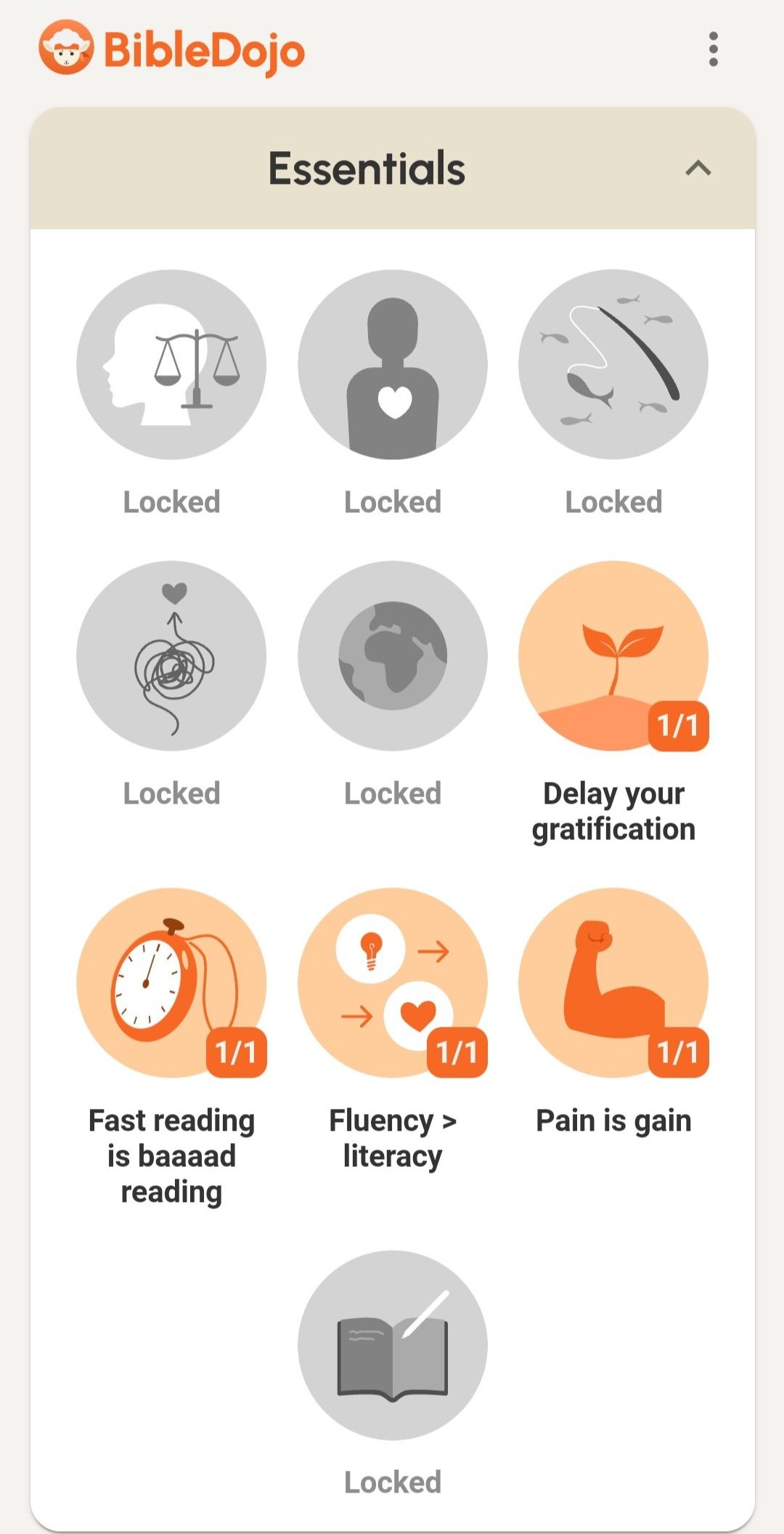
We implemented “locked” lessons and skills to acquire throughout each module. Users could create an account to save their progress and continue from where they left off. They could unlock more skills and badges (and later, upgrade belt colors) as they advanced through each guided module. This instilled a sense of progression and reward for users, which inspired them to continue further on in each lesson as well as subsequent modules.


UX Impact & Outcome
We received lots of ongoing positive feedback regarding how much users enjoyed this resource and are eagerly awaiting more lesson modules. Many users commented on how this interactive learning platform addressed various commonly recurring pain points of reading and understanding the Bible.
Users also highlighted how personalized the guided lessons felt and that they felt encouraged to slow down and really process what they were learning instead of simply rushing to find the correct answers. This particular aspect was one our team spent lots of time thoughtfully designing, troubleshooting, and iterating on user flow to facilitate deeper critical thinking and digesting of the material.
